PROJECT
The practicality of mobile websites can be hindered from impractical information architecture. My team members and I came across the mobile website of Target®, and noticed how it does not present site contents in an architecturally sound manner for easy navigation. We wanted to see how we could rearrange the contents, and redesign the information architecture of the site to enhance usability.
To put this plan into action, my team and I gathered input through contextual inquiries, and implemented several iterations of card sorting and tree testing, to see how the organization of the site could be enhanced. Our ultimate goal was to construct an annotated site map, and a set of wireframes to illustrate our vision.


OBJECTIVES
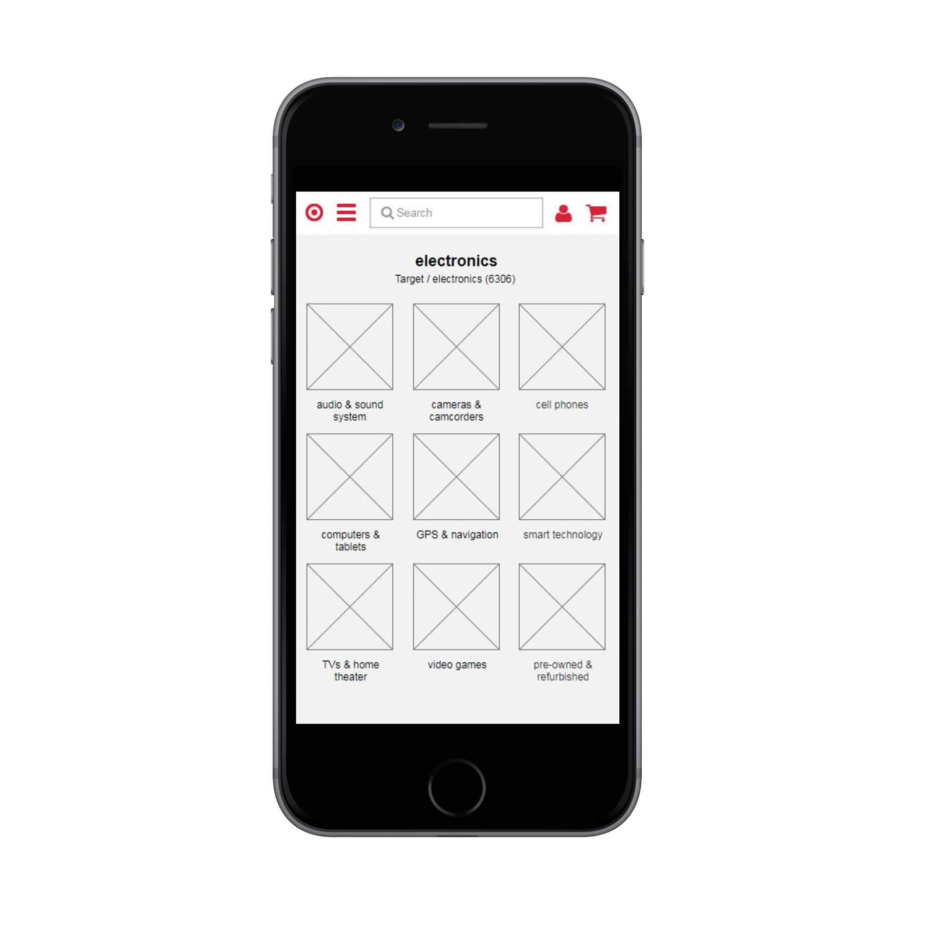
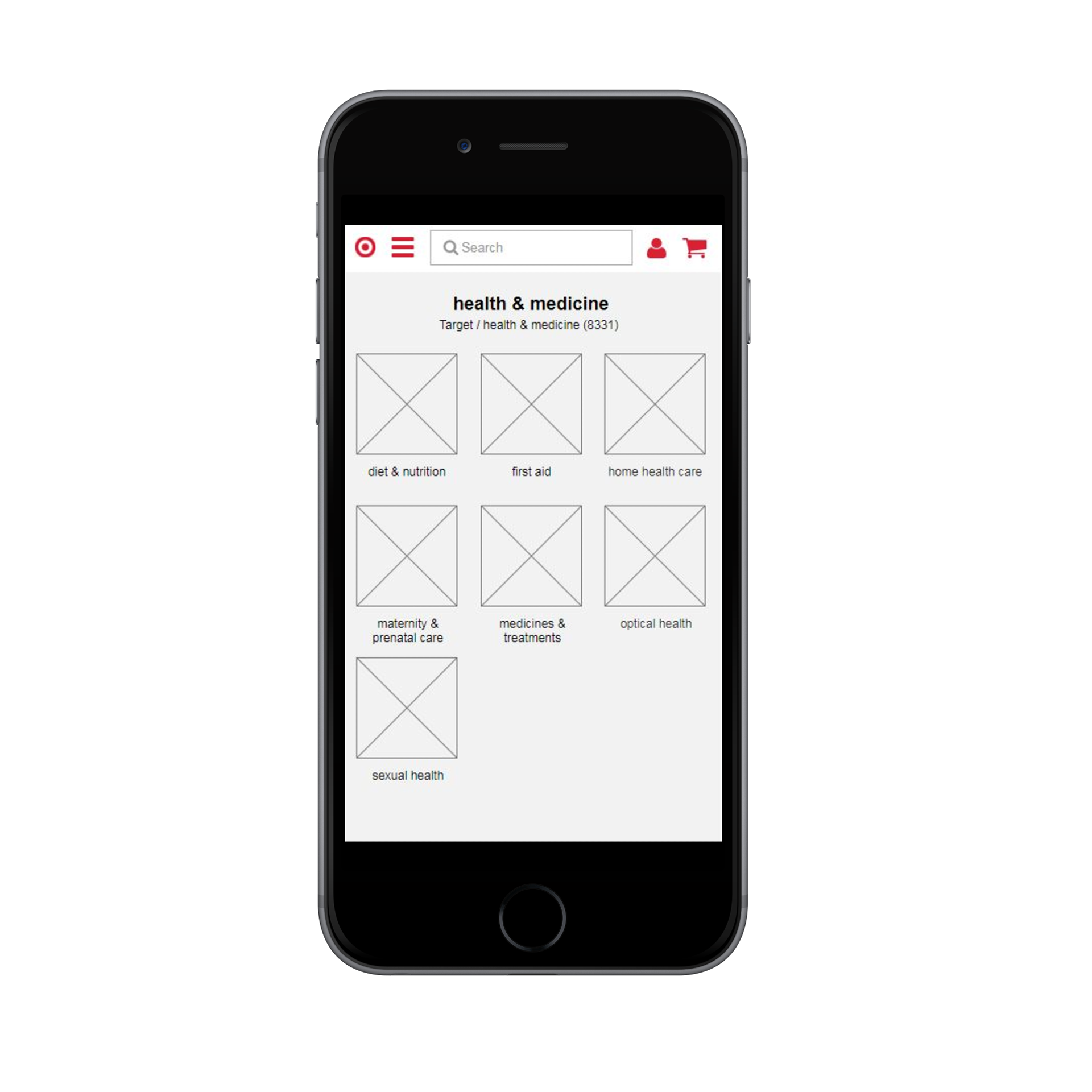
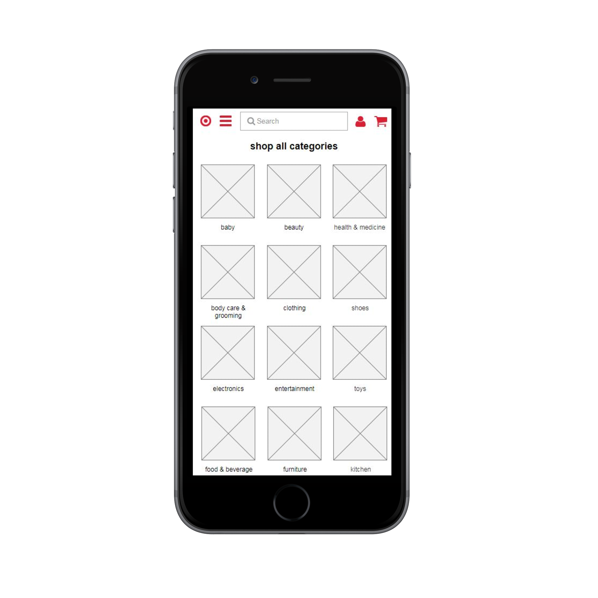
To renovate the information architecture of the mobile site, I imagined that a simple yet methodical approach would be suitable. The goal was to eradicate superfluous subcategories of the left-hand side navigation menu, and remove redundant and unnecessary information. Our intent was to reinvigorate the structure of the site to lessen the workload placed upon users to find content. For the design process, the emphasis was on simplicity, usability, and accessibility.
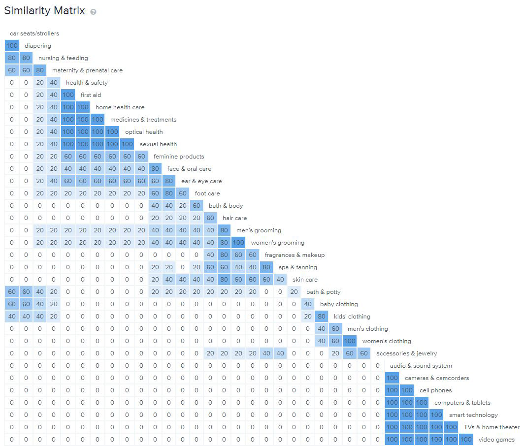
To test the site, we ran hybrid card sorts to see how users would group categories. We revised the site map based on the results, and followed up with more card sorts. Our approach was to conduct tests and make revisions iteratively.
FINDINGS
The cards used for the card sort did not make intuitive sense for the participants.
More direct and intuitive categories were necessary to increase the agreement score among the participants.
For the tree testing, the success rate for the three tasks was 80%.
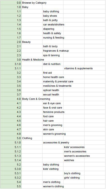
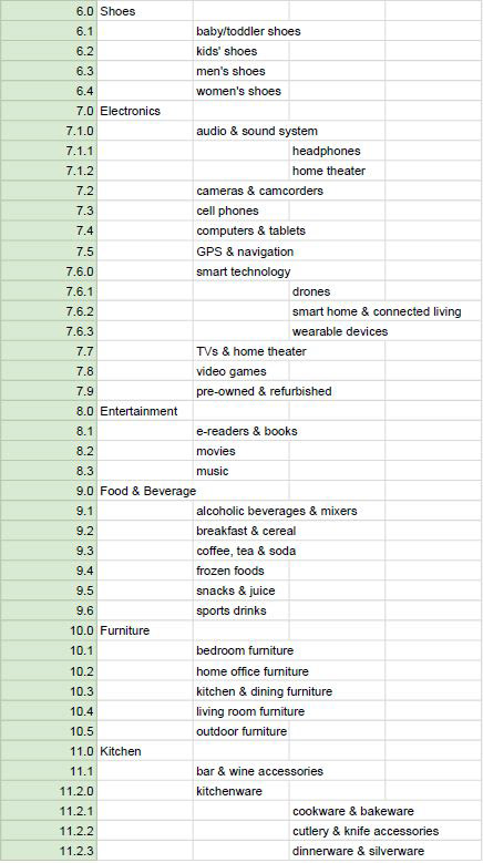
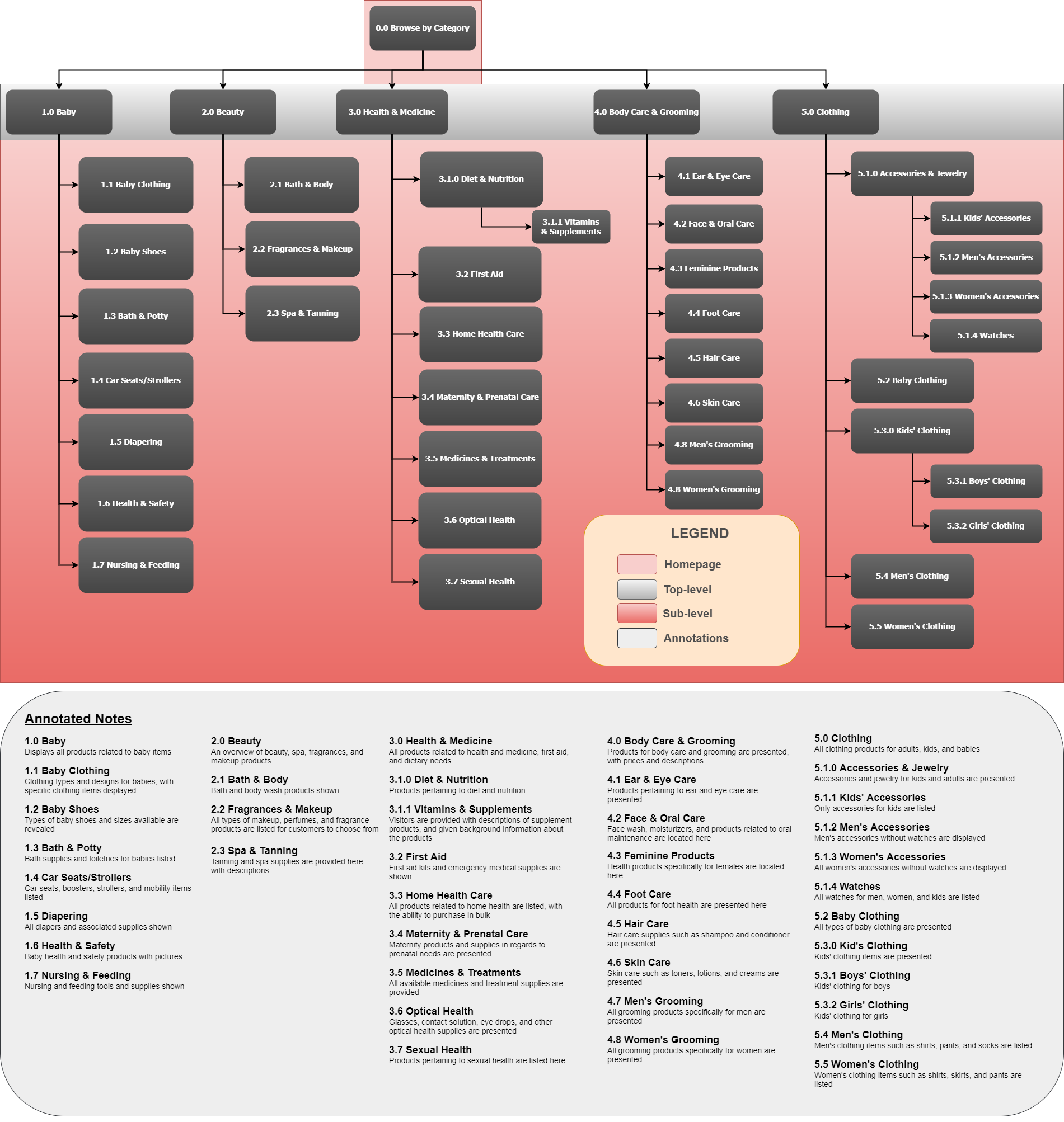
SITEMAP
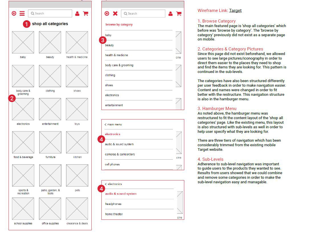
Annotated wireframe
RETROSPECTIVE
Creating and revising the content inventory was one of the more challenging tasks for the project, and the test results proved to be helpful for revising the inventory.
For the first card sort, analyzing the results was demanding due to the numerous cards used, which resulted in the results being scattered and a bit convoluted. In hindsight, it would have been ideal to create a more refined content inventory from the beginning, which would have made all the testing, test result analyses, and sitemap revisions much more efficient.